FRONT COVER
ASSET 1 - Graphic Steam

I have made graphics for my front cover to denote certain visual aspects, in this particular instance i created graphics to represent steam over the words 'Scolding Hot', I wanted to add some steam above this to resemble the idea of coffee so the words and graphics both created the same connotations this making it easier for the reader to understand what the contents of the magazine are.
To create these graphics I used the pen and eraser tool, I started off creating a new layer for the document, I added the graphics on anew layer so i could erase and draw the graphics without disturbing any other assets on the page.
I used the pen to draw the original outline of the steam but used the eraser to clear up the edges this I think was quick and effective.

I wanted to create this graphic in particular to connote a visual link to the words, I wanted to add in the steam graphics to create the analogy that the word hot was a cup of coffee, this would appeal to the audience of a local magazine as this creates a humorous style of cover lines and this is a conventional aspect of local magazines to include humour in the style of puns or jokes.
ASSET 2 - Banner

I created this asset by using shape tools, I began to make the asset by placing two rectangles, I then created two contrasting rectangles that would act as a small banner, these rectangles are placed in yellow and brown to carry on the consistent colour scheme on the page. I then moved onto placing writing in each which read 'Create Coffee owner Alan Gavin', i split this quote into two sections and changed the colours to make them contrast the banners, this once again was done to draw attention to the cover line and make it stand out on the page as it explained who the main cover model was this is a huge convention in the local magazine genre therefore i found it important to emphasis.
I used the rectangle tools to place the original shapes and then used the bucket tool to add the contrasting colours, I used the drag tool to scale and place the text to fit the rectangles.
I placed this banner explaining who the main cover image was in such a bright and eye-catching colour to connote the importance of its contents, the significance of the banner is very obvious due to its size and colours and this is done purposefully as its a major convention that is used in all magazine genres as the main cover image is placed to pull the reader into reading more about them inside therefore making them known and appear interesting on the front cover is key.
 ASSET 3 - Ribbon Graphic
This asset I made acts as a banner on my page, I started off by placing a thin rectangle on the page, I knew i wanted to create a ribbon like shape at the end of this rectangle so I used the rubber tool to create the inverted triangle shape, I held the shift tool down whilst using the rubber to create sharp lines in the shape, this allowed me to get sharp and precise lines in the shape and fully make the ribbon effect.

After being happy with the first rectangle I decided to copy and paste the layer to create an exact copy of the first rectangle I then could slant and place them at a certain angle to create the ribbon effect and i did this by using the drag tool, overall I wanted to create this ribbon effect to create connotations of winning or a gift for the reader, I thought the idea of the ribbon almost rapping around the magazine was very visually appealing and had seen a similar style on the magazine Kerrang confirming that it fitted into the magazine genre.
The ribbon was designed and placed in order to conform to conventions of a local genre magazine, I placed the banner to represent and connote importance as it will be advertising the main cover image model, once again as the main cover image is placed to pull the reader into reading more about them inside therefore making them known and appear interesting on the front cover is key and so making graphics such as this banner to place contrasting text in is really important to ensure its eye-catching for the reader.
CONTENTS PAGE
ASSSET 1: Contents page images
I wanted to place images on my contents page to create a visual aid to accompany the page numbers and titles, the images that were chosen had to represent the contents of the magazine and give an overall sense of the articles included inside.
I chose to have 4 main images placed on the contents page.
The first image featured a range of objects e.g plants pencils and vintage board games, I wanted to include this
specific photo as I thought it captured
quite a lot of interests that the readers of BUZZ would have e.g arts and crafts and environmentalists, this image demonstrates passions and values that are strongly felt in the S8 postcode.

For the second image placed I wanted to have include a recognisable Sheffield landmark, this image was taken in the botanical gardens in Sheffield, the domed architecture is recognisable in the background of the image however the inclusion of plants in the image represents the green element that Sheffield does represent, in the image itself it shows an element of depth of field, the leaves themselves are in focus however are silhouetted by the glass roof above and this overall creates a really unique and intriguing image.
The third image included is a cup of coffee this image signifies the food and drink portion of the local magazine, it also relates heavily to the exclusive interview advertised on the front cover page for Create Coffee exclusive interview. The coffee cup also is placed to connote relaxation to the readers, personally the thought of coffee means relaxation and a break this should be an idea that the magazine represents as its a very relaxed and calm magazine.
For my fourth image I have chosen to place a woodland image, this image is chosen to represent the greener side of Sheffield, alike the winter gardens image I wanted to really represent the community that THE BUZZ features. I really like the image, I feel like the strong sunlight in the image represents.
ASSET 2: Banners

I have created banners to emphasis subtitles and page numbers, I have done this by first off selecting the shape tool, I have placed the rectangles in a baby yellow colour to frame the page numbers to connote upbeat and happy emotions, I wanted the yellow tones to also represent sunshine and positivity as I think they are good associations for the magazine and represent the article tones.

I placed the rectangle directly over the serif number so I could then select the menu bar and then arrange it to the back this was done so it was the bottom layer. This was important so that it contrasted and emphasised the numbers, because the pag
e numbers are one of the key conventions for a contents page it was very important that they were as eye-
catching as possible.
After sending it to the bottom layer I then proceeded to scale it to perfectly fit the number, this was very key to ensuring that the page looked neat and not too chaotic with the large number of banners on the page.
ASSET 3: Graphic page numbers

This graphic was created to contrast the page number that the pictures on the page correlated to,
I began creating this
asset by creating a circle graphic, I created this graphic by selecting the oval shape tool, I
created the circle with a white fill and a black outline to ensure that it would contrast all the images that needed the page number graphic, this was really important as the page numbers as mentioned before are a key asset on the contents page and are the main purpose of the page this means that the numbers have to be eye-catching and clear for the reader.


I then proceeded to create a text layer with the number 7 as this is the page that the image correlates to, I created the text and then continued to put it in a serif font, I found that placing my numbers in a serif font contrast the san serif font used for the page description, even though these pictures don't have a written description with them unlike the columns underneath I wanted to have a continuous theme.
After putting the text in the vogue font, I then changed the font size to 30 to ensure that it would be visible from a distance.
DOUBLE PAGE SPREAD
ASSET 1: Double Page title

I began by creating a rectangle using the shape tool on the tool bar, I decided i wanted all the rectangles to be in black to contrast the white text most powerfully but also to match the monochrome colour theme of the page to create continuity to the page.

After creating the rectangle i then experimented with rotating and scaling it I did this using the move tool and hovering over the shape to rotate it, I felt like getting a diverse mix of rectangles of shapes and angles would provide the best results.

I then continued to add the text to the box, I chose the font Arial Black as its strong san serif would allow it to be easy to read from afar which was important in this respect due to the busy title.
I then continued to scale the text using the shift and move tool, it was important that i scaled the text to fit the shape of the rectangle as this allowed the text to be framed by the singular banner, this title in particular fits the conventions of a local magazine as its quirky and unique aesthetic matches the independant businesses covered.

I started to then use the technique of placing several rectangles so i could visualise what the finished word would look like, this allowed me to tweak the positions of the rectangles without the complications of having the letters to also rotate and scale accordingly.

I personally really like the layout of the first word 'Create' I have tried to create an almost mirroring effect with the positions of the rectangles as this is a very aesthetically pleasing technique used in magazine conventions.

After being happy with the layout of the rectangles I then progressed onto adding the text, I am really happy with the results and think it embodies many of the featured local businesses in the magazine.
After finishing all the words of the title I then placed it onto the Indesign document and scaled it down, I placed it down in the left bottom hand corner so it was prominent but not detracting from the main cover image.
I have created this graphic purposefully to create certain connotations for the double page spread, I wanted to have a title that created alternative connotations, taking inspiration from an indie magazine that created a similar graphic I wanted to ensure that it was unique and would represent the aesthetic of CREATE COFFEE.
 ASSET 2: Low opacity rectangle

I began by creating a rectangle using the shape tool, I created the shape and bucket filled it the teal colour, I then began to rotate and scale the shape to create the desired shape for the page, I did this by using the move tool which i then turned into the rotate tool by hovering over the shape. I really like the final shape as I think it covers the right amount of space on the page to do its purpose without overtaking the page.
I then progressed onto adding the shape to the document and scale it to the right size according to the page measurements.
Overall i think placing the shape engages the second page into the house style.
I have created the graphic in particular to add colour to the double page, this has been done to make the page more attractive for the reader, the page previous to this was very monotone and didn't stand out. The graphic creates a continuous house style on the page, this is very conventional for all magazines to have and is uncommon if the page has a huge range of unlinked colours, by following codes and conventions of double page spreads it will allow the reader to enjoy the page more due to the familiarity of the layout
ASSET 3: edited and unedited images
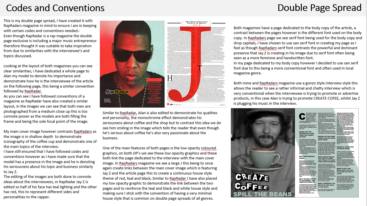
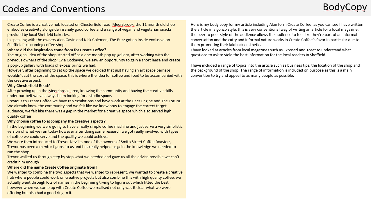
Double page image (unedited)
This picture will be the main cover image for my double page spread, I have chosen this picture in [particular due to the unique depth of field and composition of the image.
The image is very striking due tot he depth of field, I had the model hold out the coffee cup which is key iconography for the article, I then shifted the cameras focus onto the coffee cup, this allowed me to blur out the model and the first focal point of the image is the coffee cup.
The unusual depth of field adds a new element to the image and features both the interviewee and the subject of the article this allows the image to be heavily related to the article and therefore the whole page itself being cohesive in theme.
I also really like the compositon of this image, I tried to take the image with the rule of thirds in mind this allowed the subject and the coffee to be very central and aesthetically pleasing, if I was to retake the image I would lift the camera slightly as an improvement of the image would be to have the whole of the models head in the image as currently its cut off slightly.
Double page image (edited)
I have edited this image to fit the genre and contents of my double page spread, as mentioned in the last image one of the main strengths of the image is the emphasis on the coffee cup which is in a deep depth of focus contrasting the shallow depth of the model.
To emphasis the iconography of the coffee even further I have chosen to create a selective colour image, I have placed the image in monochrome except for the coffee cup which I have left as the light green colour is going to be one of my main house style colours for the page. The selective colour editing of the image I think is a definite strength as I think it just adds another level of emphasis on the topic of the article.
I created the selective colour by using the selective tool and selecting the coffee cup carefully before inverting the selected area, after this I applied a monochrome effect and later used the curve adjustment to create extra contrast of black and white in the image.

 I next decided to place an underlining rectangle
under the title, I wanted to place a rectangle to demonstrate the texts
importance, I placed the rectangle using the shape tool and decided to place it
also in a black tone to match it with the title and demonstrate how its
associated to the main text on the page.
I next decided to place an underlining rectangle
under the title, I wanted to place a rectangle to demonstrate the texts
importance, I placed the rectangle using the shape tool and decided to place it
also in a black tone to match it with the title and demonstrate how its
associated to the main text on the page.
 Next after placing the underlining graphic I
added some text, I decided to vary the body copy font to create contrast, I
placed the number in a large and serif Vogue font as i really like the
aesthetic of the text and thought it created a sophisticated tone for the page,
to contrast this i also added the lines of text next to the numbers in a san
serif airfly font, this font creating connotations of modernity and visibility. Both connotations for both fonts are positive and attract my overall target audience.
Next after placing the underlining graphic I
added some text, I decided to vary the body copy font to create contrast, I
placed the number in a large and serif Vogue font as i really like the
aesthetic of the text and thought it created a sophisticated tone for the page,
to contrast this i also added the lines of text next to the numbers in a san
serif airfly font, this font creating connotations of modernity and visibility. Both connotations for both fonts are positive and attract my overall target audience. After placing the text I decided to place some
images to create the structure more, I placed the images from organised files
and made sure that I scaled the borders down to the wanted size before fitting
the border with the content, I ensured that I was adding images that connoted the theme of the local newspaper and images that would entice the Sheffield
area, e.g adding images that were of local areas that would be recognised by
readers.
After placing the text I decided to place some
images to create the structure more, I placed the images from organised files
and made sure that I scaled the borders down to the wanted size before fitting
the border with the content, I ensured that I was adding images that connoted the theme of the local newspaper and images that would entice the Sheffield
area, e.g adding images that were of local areas that would be recognised by
readers. After I had finished setting the layout I began
editing the words and text on the page, I began with adding a drop shadow to
all the writing, I did this by clicking ctrl, cmd and m this bringing up the
effects menu, I decided I didn't want to add a harsh drop shadow so I set it to
a weaker 38% his allowed the text to be eye catching and stand out but not
look fake and unrealistic.
After I had finished setting the layout I began
editing the words and text on the page, I began with adding a drop shadow to
all the writing, I did this by clicking ctrl, cmd and m this bringing up the
effects menu, I decided I didn't want to add a harsh drop shadow so I set it to
a weaker 38% his allowed the text to be eye catching and stand out but not
look fake and unrealistic.
 After placing the banner I decided that i wasn't happy
with the layout as it didn't resemble any real contents page and i thought it
looked very unrealistic, I decided that instead i would try and place my text
in the column guides as the text on the page looked sporadic and disorderly.
After placing the banner I decided that i wasn't happy
with the layout as it didn't resemble any real contents page and i thought it
looked very unrealistic, I decided that instead i would try and place my text
in the column guides as the text on the page looked sporadic and disorderly. Before I started to sort all my text out and into
the columns I added equal banners to the top and bottom of the page this acted as a
guideline for the bottom of the columns and allowed me to add more colour to
the page and link assets together as my next step was to colour the banner to
match the two thinner banners.
Before I started to sort all my text out and into
the columns I added equal banners to the top and bottom of the page this acted as a
guideline for the bottom of the columns and allowed me to add more colour to
the page and link assets together as my next step was to colour the banner to
match the two thinner banners.
 2. After re-arranging the titles I then looked at my
columns of text, I began by removing all drop shadows as its very
unconventional for the body copy to have drop shadows, after this I then
changed the font size to all the same and arranged it in a very tightly packed
column style this allowed me to include a lot more content and it looks so much
more conventional and realistic then before when the text as scattered across
the page.
2. After re-arranging the titles I then looked at my
columns of text, I began by removing all drop shadows as its very
unconventional for the body copy to have drop shadows, after this I then
changed the font size to all the same and arranged it in a very tightly packed
column style this allowed me to include a lot more content and it looks so much
more conventional and realistic then before when the text as scattered across
the page. 3.After adding so much more text to the page to create
the column styles its created a huge difference and I have also included
headings, these allow the text to be categorized and organised making it more
efficient for the reader once again helping the reader digest information as
easily as possible.
3.After adding so much more text to the page to create
the column styles its created a huge difference and I have also included
headings, these allow the text to be categorized and organised making it more
efficient for the reader once again helping the reader digest information as
easily as possible. 4. After adding most of images on the page I decided to
link these visuals to page numbers, for doing this I added small white circles
in the corners of the images this allowed me to add page numbers and not take
away any visuals from the images. I created these circles by using the text
tool and made sure to add a stroke on the outlines to emphasis the contrast
between the image and shapes. I thought white would be the best colour to add
to the circles as my images have darker tones therefore white would be the best
contrasting colour.
4. After adding most of images on the page I decided to
link these visuals to page numbers, for doing this I added small white circles
in the corners of the images this allowed me to add page numbers and not take
away any visuals from the images. I created these circles by using the text
tool and made sure to add a stroke on the outlines to emphasis the contrast
between the image and shapes. I thought white would be the best colour to add
to the circles as my images have darker tones therefore white would be the best
contrasting colour.


