1. Editing the main cover image

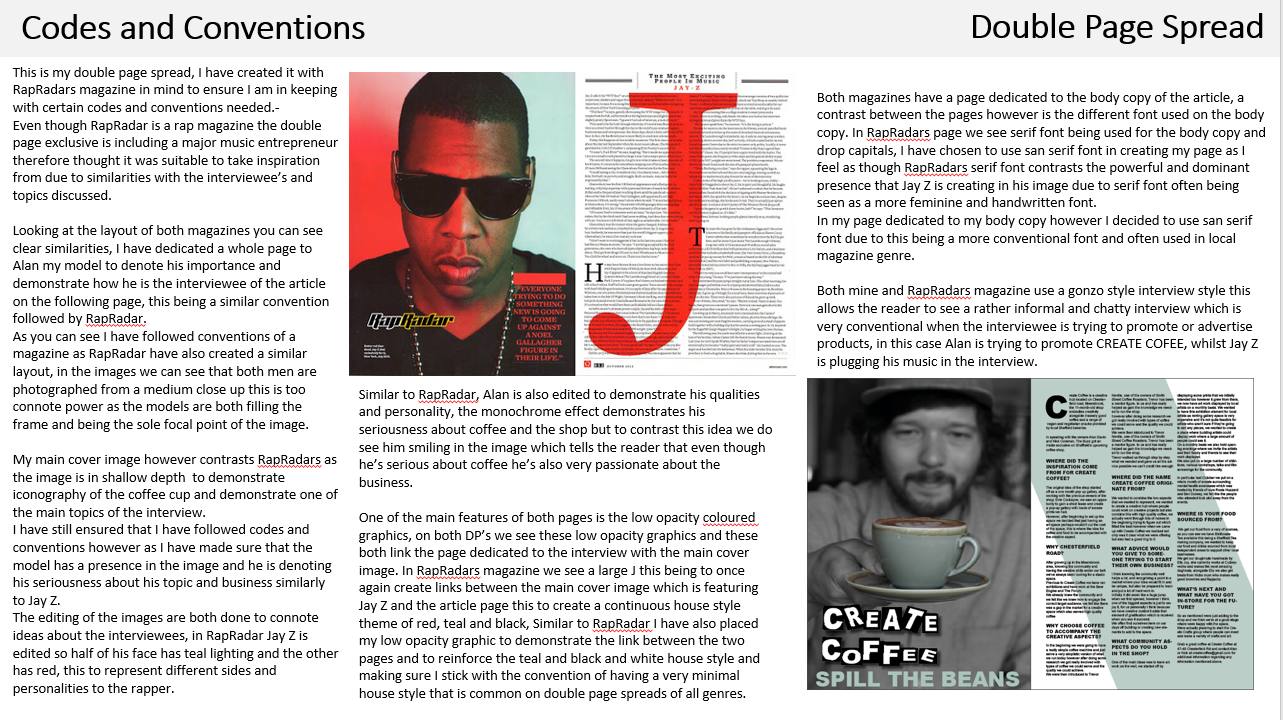
In these two screenshots it demonstrates the editing process of the main cover image of my double page spread. I began this process by selecting the coffee cup that is being held by the model, I selected it by using the quick selection tool and then progressed to inverse this selection so it now everything was selected but the coffee cup and from here on I continued to add a monochrome filter to the selected areas.
The selective colour around the teal coffee cup is the basis of the house style this then allows the two pages to link together this demonstrating synergy in the page.
I added a monochrome effect to the image and changed the colour levels in the image to create a deeper more contrasting monochrome effect.
I placed this filter to the image to add emphasis to the coffee cup which was very symbolic in the image as the exclusive and image is all very heavily related to coffee and is the product that is being discussed in the article. Due to this iconography of the coffee cup the reader can quickly understand the articles content and the selective colour image really helps to make this a quick deduction.
I wanted to add such a heavy effect on Alan to allow the audience to gain a more narrative aspect from the image, I think the selective colour connotes what the article is about and provides connotations of the mode of address also used in the article.
2. Creating the title
For the title of this page I wanted to have a very eye-catching and loud layout. Its very important and very conventional for the title of the page to introduce the interviewee of the exclusive interview so it can catch the readers interest.
I decided to look at Kerrang and other popular magazines with impressive graphics to take inspiration, this is where I found this font idea of having varying sized rectangles containing the text.

I began by creating a rectangle using the shape tool on the tool bar, I decided i wanted all the rectangles to be in black to contrast the white text most powerfully but also to match the monochrome colour theme of the page to create continuity to the page.

After creating the rectangle i then experimented with rotating and scaling it I did this using the move tool and hovering over the shape to rotate it, I felt like getting a diverse mix of rectangles of shapes and angles would provide the best results.

I then continued to add the text to the box, I chose the font Arial Black as its strong san serif would allow it to be easy to read from afar which was important in this respect due to the busy title.
I then continued to scale the text using the shift and move tool, it was important that i scaled the text to fit the shape of the rectangle as this allowed the text to be framed by the singular banner, this title in particular fits the conventions of a local magazine as its quirky and unique aesthetic connotes the independant businesses covered.

I started to then use the technique of placing several rectangles so i could visualise what the finished word would look like, this allowed me to tweak the positions of the rectangles without the complications of having the letters to also rotate and scale accordingly.

I personally really like the layout of the first word 'Create' I have tried to create an almost mirroring effect with the positions of the rectangles as this is a very aesthetically pleasing technique used in magazine conventions.

After being happy with the layout of the rectangles I then progressed onto adding the text, I am really happy with the results and think it embodies many of the featured local businesses in the magazine.
After finishing all the words of the title I then placed it onto the Indesign document and scaled it down, I placed it down in the left bottom hand corner so it was prominent but not detracting from the main cover image.
3. Creating the sub-title
After placing the title of the page i wanted to support it with a subtitle, this conventionally is either a quote from the article or a pun to act as a pull for the reader, I decided to make a play on words and write 'Spill the Beans'.
I wanted this subtitle to be much more simple in comparison to the title to not make the page too busy. I began writing it below the title on the left hand side of the first page as this would allow it to explain better the main title.
I then changed the font of the original text to Arial Regular this would match with the original title however the fonts don't clash as the scaling of the text in the title has distorted the text in comparison.
I wanted it to be in san serif once again to increase ease in reading from a distance but also for it to denote modernity to the reader this is also the most common typeface to use in magazine titles, especially my genre of local magazines.
I wanted to put this text in the same colour as the coffee cup which is in a teal colour, this would create a house colour theme of black, white and teal .

To make sure i got the matching colour to the cup itself I went on photoshop and opened the colour picker, here i could copy the code highlighted which corresponds to the colour desired, I copied this and then pasted it into the Indesign colour picker to ensure that i had the perfect shade throughout the page.
I felt that this house style in particular matched the pages contents as the colours create calm and relaxed connotations for the page this is very similar once again to the atmosphere Create Coffee strives for.
4. Page 2 asset


To create continuity between pages and house style I decided to create a low opacity shape that would sit underneath the text, this would act as a pop of colour for the page and create an eye-catching aspect to the page.

I began by creating a rectangle using the shape tool, I created the shape and bucket filled it the teal colour, I then began to rotate and scale the shape to create the desired shape for the page, I did this by using the move tool which i then turned into the rotate tool by hovering over the shape. I really like the final shape as I think it covers the right amount of space on the page to do its purpose without overtaking the page.
I then progressed onto adding the shape to the document and scale it to the right size according to the page measurements.
Overall i think placing the shape engages the second page into the house style and allows synergy across the pages, this is important as it connotes to the audience the continuous theme which looks very professional.
5. Adding the article
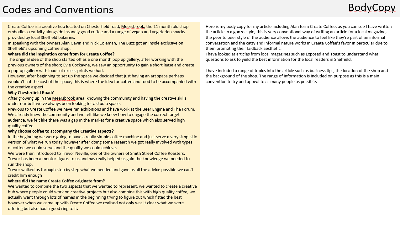
One of the most important features on this page is the article, I decided that instead of having the article spread across two pages I just wanted to dedicate one page to containing all the body copy.

As I had already started to prepare the page for body copy by adding the low opacity rectangle I began adding the text.


I had already written the article on Microsoft Word and started to copy and paste the first couple of paragraphs across to the Indesign document, I realised really quickly that i would have to set the bulk of the body copy to a low font size to ensure all the body copy could fit.
I began by placing the body copy in Arial Regular as this was a consistent font that had been used all over my page, I then proceeded to change the font size to 8pt, this allowed me to fit my body copy on the page without it being microscopic and the reader not being able to easily read it.
After placing the first introductory paragraph i started to add the bulk of the body copy which included my questions due to the article being written in a gonzo style. After looking at Kerrang and Exposed double pages I understood that a common convention followed on a double page spread is that the questions are in a larger font size or different font altogether this making it easier for the reader to understand the rough contents fo the article after quickly scanning the page. I decided to really make the questions stand out form the rest of the body copy I placed them in capital letters, this i did by pressing ctrl and clicking and here i found the option to change the letter case. I felt like having the questions in capitals enabled them to stand out and denote importance to the reader.


I then continued to heighten the font size to 11pt and change the font to Arial Black, this was a similar font however was bolder and created more emphasis on words.
Overall I think placing the questions in this bolder bigger font allowed the page to look more conventional and realistic considering the local genre.


After looking over the page i realised that I had to add a drop cap, this is where the first letter of the article is in a big bold font alike the questions however extremely emphasised this is a very common convention in all magazine genres therefore I understood this was needed to make my magazine fit its stereotypes.
I began by increasing the letter size by 72pt, this allowed the letter to be unmistakably a drop cap alike the questions I also placed it in the similar font Arial Black, this is a final touch to the page which i think makes a huge difference and makes it look very fitting to its local genre.